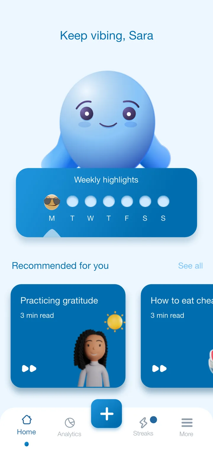
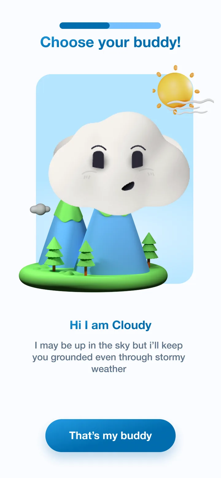
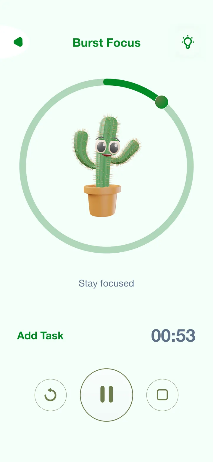
Monash Thrive is an initiative of the Turner Institute for Brain and Mental Health at Monash University and Allianz Care Australia. It gives students and staff a set of mental health and wellbeing tools in one app, with a particular focus on international students.
- 13 surveysThrive surveys of students' wellbeing, concerns, coping and help seeking, 2020 to 2022
- About 6,000students took part in the 2020 surveys alone
- 3 trialsMVP, beta and final delivery, each shaped by the last
The problem
Studying had a real impact on students' mental health, and COVID-19 made it much worse. The research showed that help seeking and mental health literacy were alarmingly low, especially among international students, partly because of the stigma attached to mental health concerns.
There are already plenty of mental health apps. The question was what could be built that students would find genuinely useful and, just as important, would trust.
Product hypothesis: if we can create an engaging solution that offers a diversity of mental health and wellbeing tools, we can improve mental health literacy, reduce stigma, and increase rates of early help seeking in our student community.
What the research found
We started with foundational research: published work on mental health tools and coping strategies and how well they work, recommendations for designing health technology, case studies from clinical apps such as Harvard's mindLAMP and commercial apps such as Smiling Mind, and competitor research. We then ran one-on-one interviews and focus groups to understand how students cope with stress and when they seek help.
Alongside a clear need for a free tool, the sessions kept surfacing the same themes:
- Apps felt too generalStudents said mental health apps aren't personalised to their needs.
- "Boring"A large group found mental health apps boring and never felt the need to use them.
- Privacy is a major concernStudents feel vulnerable sharing mental health data with an app.
- They want controlStudents wanted more say over how the apps they use look and behave.
- An emotional connection mattersHaving a reason to keep coming back was important.
- Academic stress is the number one issueAnd most students are better at caring for others than for themselves.
- Incentives help habits stickRewards made it easier to form and keep a new habit.
- Stigma is real1 in 4 students believed others would think less of someone who had sought professional mental health support.
Students were direct about what they wanted:
"I think a really good app in terms of design would be Duolingo or something like that. Really colourful, lots of their own animations and very little on the screen at once."
"More aesthetic, more appealing; some pretty colours, different fonts. Not as stoic and textbook-like."
"I want different colours, just the dumb stuff like that which just makes it feel like it's yours."
"I love tamagotchis, it makes me feel responsible."
Who we designed for
Empathy maps and the affinity work became two personas. Each one carried a hypothesis we could test.
Susie
International student from China · Business and Finance · kickboxing
I am away from my family for the first time in my life and I don't really know many people here, it's scary.
- Pain points
- Misses her family and friends at home. Doesn't like remote learning and socialising over Zoom. Finds it hard to adjust to a new culture so quickly. Won't consider counselling because she worries it might affect her visa.
- Goals
- Get really good marks, get a good job, and make more friends.
- Hypothesis
- If Susie has a tool to monitor her mental health and keep it in check, she can seek support at the right moment and focus on getting good grades.
Rob
Arts student · plays footy with his new mates
If I talk about this stuff to my friends, they're going to mock me.
- Pain points
- Has lots of friends but no one he can talk to about his problems. Struggles to form good habits and to focus. Bottles things up.
- Goals
- Improve his emotional wellbeing so he feels motivated and performs better in sport.
- User story
- "I want a personal tool that I can trust to keep my vulnerabilities secure and guide me when I need it."
How we worked
We designed a lifecycle for a long-term study: listen to students, build, test, and fold the feedback back in at every stage. During the beta and final delivery we revisited whichever steps we needed.
- Fundamental researchPreventative mental health research, our own survey data, and the tools already on the market.
- Quantitative research13 Thrive surveys between 2020 and 2022 on wellbeing, concerns, coping and help seeking.
- Qualitative researchInterviews, focus groups and user testing, then affinity mapping and empathy maps.
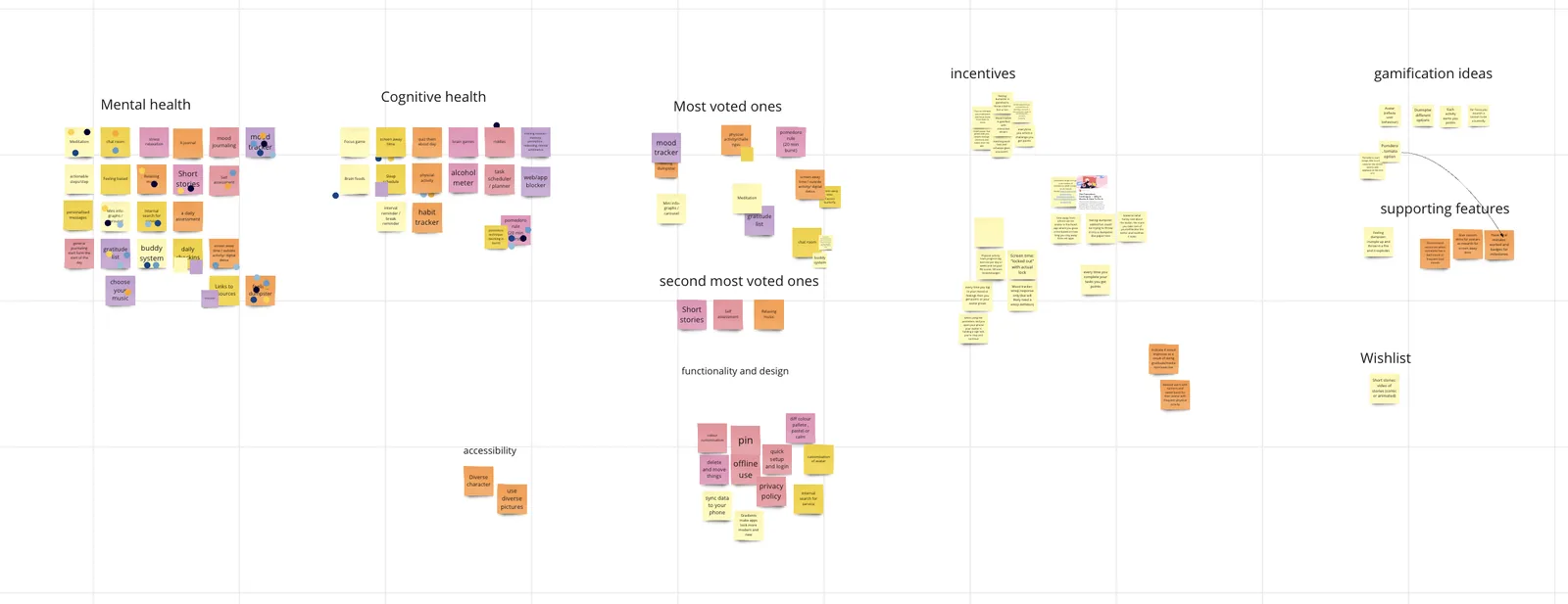
- Feature identificationWorkshops with students and stakeholders to build a prioritisation matrix, revisited after every trial.
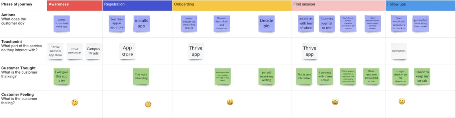
- User journeysJourneys, user flows and storyboards for each step of the lifecycle.
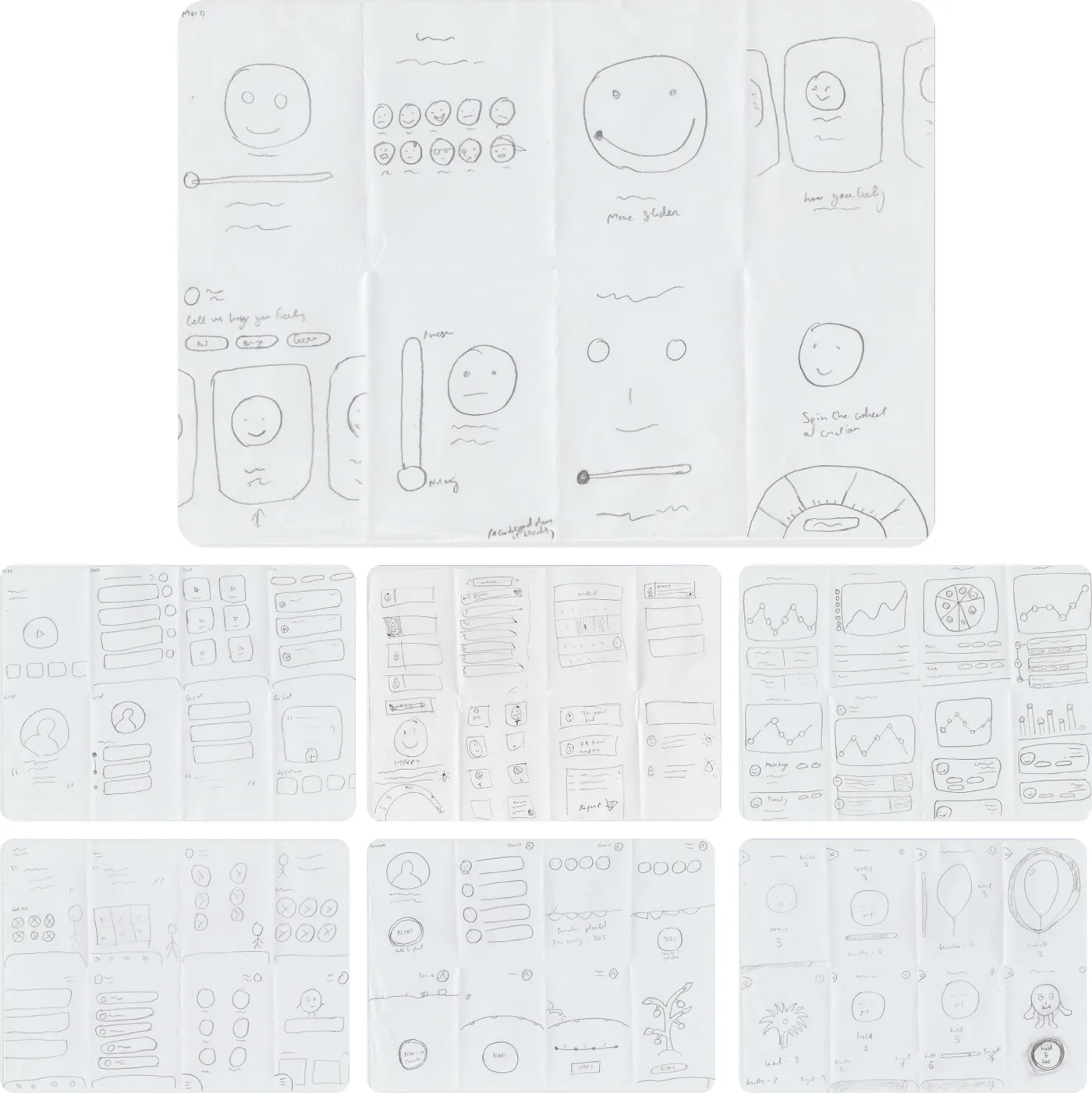
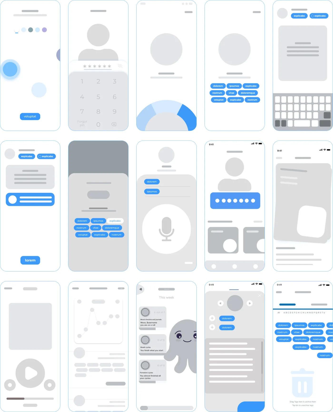
- Experience design and testingCrazy 8s, then lo-fi wireframes and interactions tested with students.
- Visual design and testingAn identity for the app, tested with users and iterated on.
- Long-term testingDay-to-day usage over each stage, because a week with a prototype isn't the same as months with the real app.
Feature prioritisation matrix
The team was small, so we had to pick our battles: what the MVP would start with, what each trial would validate, and when.
MVP: do now
High impact, low effort
- Mood tracker
- Journaling
- Personalise colour
Beta: validate from MVP trials
High impact, high effort
- Mood analytics
- Secure login with PIN or Face ID
- Voice journaling
Final delivery: validate from beta trials
Low impact, low effort
- Meditation library
- Focus timer
- Character selection
- Gratitude list
Reassess through the journey
Low impact, high effort
- Buddy system
- Chat room
- Brain games
- Personalised goal setting
What we designed
By the end of the research we were clear on the challenge: make something engaging, change the culture around mental health and its stigma, raise students' mental health literacy, and make sure they could trust the app. These ideas carried that through:
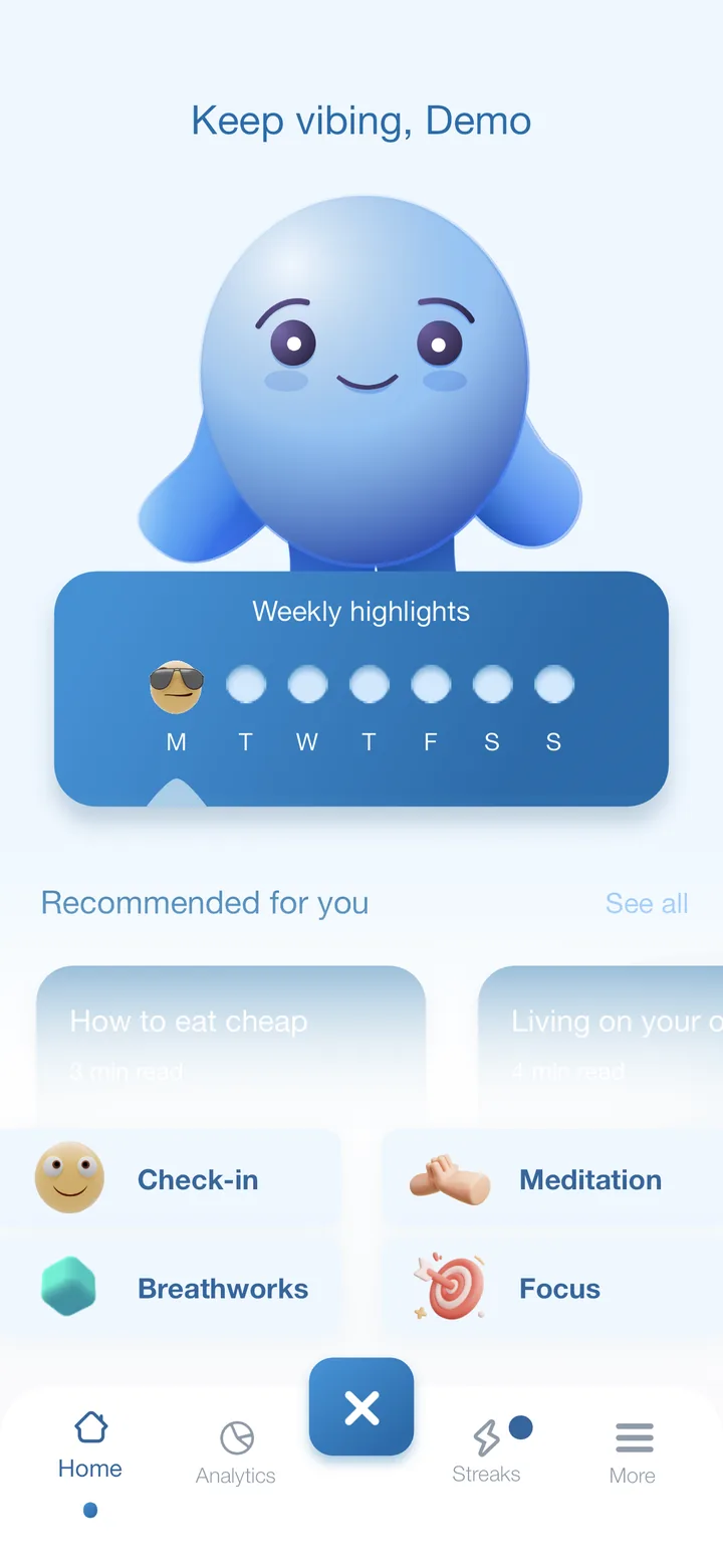
- An emotional connectionA buddy character goes through the journey with each student. The characters were tested through surveys and guerrilla testing to make sure they reflected the university's diversity, and notifications come from the buddy, so students feel responsible for it.
- Control over privacyFace ID or a PIN locks the app. No mental health data is saved to the cloud, and deleting the app or the account permanently deletes the data.
- Autonomy over the appStudents can make it look and behave the way they want, with five themes and a dark mode for each.
- Personalised recommendationsReads are recommended from each student's activity and check-ins. That builds mental health literacy, which helps students and the friends they support.
- More than one way to copeWellbeing looks different for everyone. Some students journal, some meditate or do breathing exercises, and some cope with academic anxiety by getting more done.
- Emotional awarenessMood patterns show students what bothers them and what helps.
- Tools for academic stressMeditation, breathing exercises and a focus timer, for whichever approach suits.
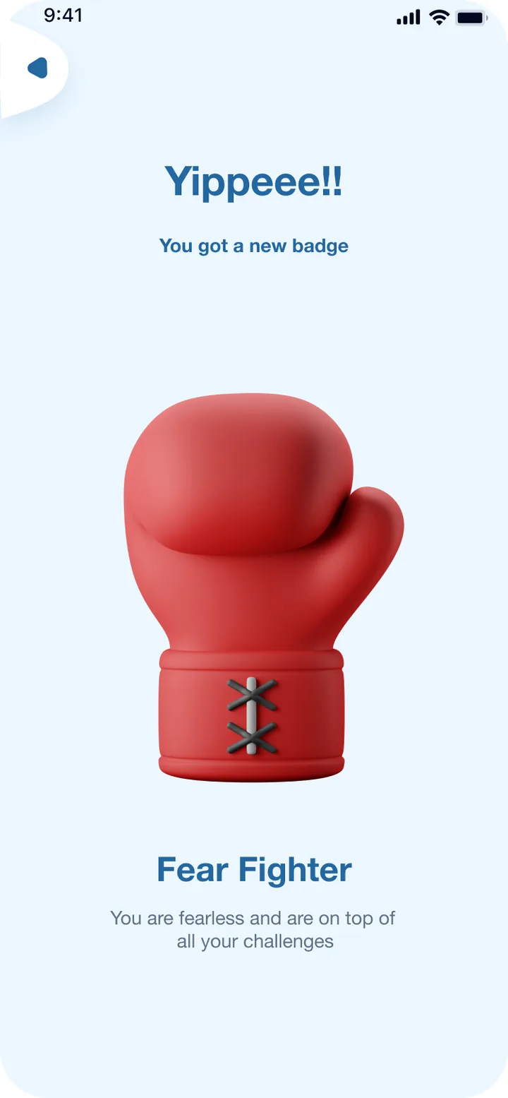
- Incentives and gamificationEvery interaction builds a streak. Streak milestones unlock badges, and badges unlock more buddies.
Visual design
To stay true to the Monash University brand, we adapted Monash's colour palettes into five mood themes, each with its own dark mode, and used the brand font Roboto Condensed. Icons are round, soft and thick, following Apple and Material accessibility guidance. We chose 3D illustrations over flat ones: students loved them, they're easier on the eye, and flat graphics blended into too many of the theme colours to stay accessible.
A content audit tracked every piece of text and visual communication in the app, on the website, in emails and in notifications, so Thrive always sounded like the same friendly buddy. The characters were later animated in Rive. We wrote about that in bringing a mental health app to life with Rive.
Results
Testing a prototype for a week is very different from living with the real app, so the final trials focused on everyday use. These results come from the second long-term trial: 12 weeks with 150 students.
usability score on the System Usability Scale (SUS), from 150 students over 12 weeks
said the app was likely to increase their intention or motivation to seek help
said it was likely to increase the rate of early help seeking
"Do you feel using this app…" Share who agreed or strongly agreed
Most students agreed or strongly agreed that the app's features were well integrated and that it was easy to use, and most thought people would learn it quickly.
Some of the feedback from students in the trials:
"Been using counselling services recently after using the app. I was not motivated before."
"One of the things I like about it a lot, the app suggests me short articles to read based on the mood that I have checked in. I find that really helpful."
What's next
Thrive continues as a mental health and wellbeing tool for Monash University students and staff, and the team is continuing its studies on the app. For a shorter, non-technical version of this story, read from concept to creation: a student-designed mental health companion.