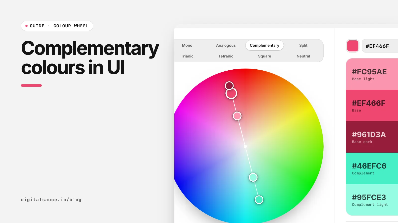
Complementary pairs are the first harmony most people learn and the easiest to overdo. Here is how to find the complement of any colour precisely, and the handful of rules we follow when we put one on a client screen. Use the free colour wheel to try each step.
What are complementary colours?
Complementary colours are pairs that sit opposite each other on a colour wheel. When strongly coloured complements are placed side by side they create the strongest contrast of hue (Wikipedia: Complementary colors). Which pairs count as complements depends on the wheel:
| Colour | Screen wheel (RGB) | Artist's wheel (RYB) |
|---|---|---|
| Red | Cyan | Green |
| Yellow | Blue | Violet |
| Green | Magenta | Red |
For digital work, use the screen wheel: it matches CSS, Figma and the way displays mix light. RGB vs RYB colour wheels explains the difference.
How to find the complementary colour of a hex code
- Convert the hex to HSL. For example,
#EF466Fis abouthsl(345, 84%, 61%). The hex to RGB converter shows HSL for any colour. - Add 180 to the hue and wrap past 360: 345 + 180 = 525, minus 360 = 165.
- Keep saturation and lightness:
hsl(165, 84%, 61%), a bright mint, is the complement.
Or skip the maths: choose Complementary in the colour wheel, type your hex, and the opposite handle shows the complement plus light and dark versions of both.
In CSS you can do the same rotation with relative colour syntax, for example hsl(from var(--brand) calc(h + 180) s l). Check current browser support before relying on it in production.
How to use complementary colours in UI
- Let one colour lead. Use the base for most brand moments and the complement for one job, such as the main call to action or a notification badge.
- Change the lightness of one side. Two complements at the same brightness fight. Darken or lighten one so the pair has a clear figure and ground.
- Keep complements apart for text. Saturated complementary text on a complementary background is hard to read even when the contrast ratio passes.
- Mute the large areas. A softened tint of the complement works well for backgrounds and cards; keep full saturation for small elements.
Complementary is not the same as accessible contrast
Hue contrast and luminance contrast are different things. Red and cyan are opposites, but at similar lightness they can still fail WCAG. Text needs at least 4.5:1, or 3:1 for large text, at level AA (W3C: Contrast (Minimum)). Do not rely on red against green alone to signal meaning either: WCAG asks that colour is not the only visual cue (W3C: Use of Color).
Complementary pairs that work on screens
| Lead | Complement used as | Why it works |
|---|---|---|
| Deep navy background | Warm yellow button | Big lightness gap, so the button reads instantly |
| Soft mint surfaces | Pink accent for badges | Muted lead, saturated accent used sparingly |
| Violet brand colour | Lime highlight in charts | The highlight draws the eye to one data point |
Colour wheelDrag a base colour round an interactive colour wheel, pick a harmony and copy the five-colour palette as CSS, Tailwind or JSON. Free, no sign-up, runs in your browser.
Open the tool →FAQ
What is the complementary colour of red?
On the screen (RGB) wheel the complement of red is cyan. On the traditional painter's (RYB) wheel it is green.
How do I find a complementary colour from a hex code?
Convert the hex to HSL, add 180 to the hue (subtract 360 if it goes over), and keep the saturation and lightness. A colour wheel tool does this for you.
Are complementary colours good for websites?
Yes, in small doses. Use one colour for most of the design and its complement for a single important element such as the main button.
Do complementary colours always have good contrast?
No. They contrast in hue, but text readability depends on lightness. Check the WCAG contrast ratio for every text pairing.
What is split complementary?
A base colour plus the two hues either side of its complement. It keeps strong contrast with less tension and gives two accents.
Read next
- Colour harmonies explained: 8 colour wheel schemes for UIMonochromatic to square, and when each works
- RGB vs RYB colour wheel: why complementary colours differWhy red pairs with cyan on screens and green in art class
- Colour harmonies explained: 8 colour wheel schemes for UIMonochromatic to square, and when each works
- HSL vs RGB vs hex: which colour format should you use?Same colours, different jobs
- Colour wheelDrag a base colour round an interactive colour wheel, pick a harmony and copy the five-colour palette as CSS, Tailwind or JSON
- All free design toolsConverters, calculators and colour tools
Last updated 16 November 2026. Sources are linked in the text. Spotted something out of date? Email development@digitalsauce.io.