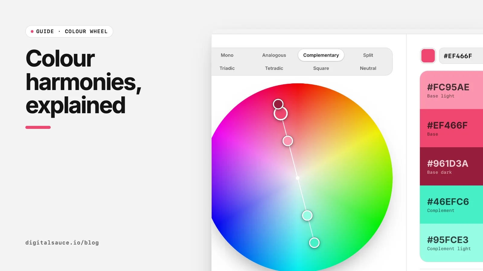
Harmonies are a shortcut, not a rule book. They give you a starting set of hues that already relate to each other, so you spend your time on lightness, contrast and proportion instead. Open the free colour wheel in another tab and switch modes as you read.
How colour harmonies work
Every harmony starts from a base hue and adds others at set angles round the wheel (Wikipedia: Color scheme). Hue is only one of three dials. The same triadic angles can give a children's toy brand at full saturation or a calm editorial palette when the colours are muted and darkened. In practice:
- Hue angle decides how much variety the palette has.
- Saturation decides how loud it is.
- Lightness decides whether text is readable on it, which matters most in UI.
1. Monochromatic
One hue in several tints and shades. It is the safest scheme for interfaces because contrast comes from lightness alone, and it is how most design systems build their neutral and brand ramps. The risk is flatness: add one accent from another harmony for calls to action.
2. Analogous
Hues next to each other, usually 20° to 40° apart. Analogous palettes feel natural, like a sunset or a forest, and they make smooth gradients. Pick one as the lead and use the neighbours for surfaces and illustration; on their own they rarely give enough contrast for buttons.
3. Complementary
A hue and its opposite, 180° away. Complementary pairs give the strongest hue contrast, which makes them ideal for a single call to action against a brand background. Use one for most of the design and the other sparingly, and avoid placing them at equal brightness side by side, where edges appear to vibrate. More in our guide to complementary colours.
4. Split complementary
The base plus the two hues either side of its opposite. You keep the punch of complementary contrast with less tension, and you get two accent colours instead of one. It is a good default when a brand needs a primary, a secondary and an accent.
5. Triadic
Three hues 120° apart. Triadic palettes are vivid and balanced, which suits games, education and charts. In UI, let one hue lead and mute the other two, or the screen turns into a flag.
6 and 7. Tetradic and square
Both use four hues. Tetradic uses two complementary pairs forming a rectangle on the wheel; square spaces four hues 90° apart. They give the most variety, so they work for category colours, tags and data visualisation, but they need a clear lead colour and plenty of neutral space.
8. Neutral
Not a classic harmony, but the one every product needs: greys tinted very slightly towards the brand hue. Tinted neutrals for text, borders and backgrounds make a palette feel designed rather than default. The wheel's Neutral mode builds a paper, mist, slate and ink set around your base colour.
Which harmony should you choose?
| If you want | Try |
|---|---|
| A calm, minimal interface | Monochromatic plus neutral |
| One button that stands out | Complementary |
| A primary and two accents | Split complementary |
| A playful brand or chart colours | Triadic or square |
| Soft gradients and illustration | Analogous |
Whatever you pick, check text contrast: WCAG 2.2 level AA needs 4.5:1 for normal text and 3:1 for large text (W3C: Contrast (Minimum)). The colour wheel shows the ratio on every swatch. For turning a harmony into a full brand palette, read how to choose a colour palette.
Colour wheelDrag a base colour round an interactive colour wheel, pick a harmony and copy the five-colour palette as CSS, Tailwind or JSON. Free, no sign-up, runs in your browser.
Open the tool →FAQ
What are the main colour harmonies?
Monochromatic, analogous, complementary, split complementary, triadic, tetradic and square. Designers often add a tinted neutral set as well.
Which colour harmony is best for websites and apps?
Monochromatic or split complementary are the easiest to make work: one lead colour, tinted neutrals and one or two accents.
What is the difference between tetradic and square colour schemes?
Both use four hues. Tetradic uses two complementary pairs that form a rectangle on the wheel; square spaces the four hues evenly, 90° apart.
Do colour harmonies guarantee good contrast?
No. Harmonies only set the hues. Contrast comes from lightness, so check every text and background pairing against WCAG.
How do I make a colour harmony palette?
Open a colour wheel, choose a base colour, pick the harmony and adjust brightness and saturation until the colours suit your product.
Read next
- Complementary colours: how to find and use them in UIFind the opposite of any hex, then use it well
- RGB vs RYB colour wheel: why complementary colours differWhy red pairs with cyan on screens and green in art class
- Complementary colours: how to find and use them in UIFind the opposite of any hex, then use it well
- RGB vs RYB colour wheel: why complementary colours differWhy red pairs with cyan on screens and green in art class
- Colour wheelDrag a base colour round an interactive colour wheel, pick a harmony and copy the five-colour palette as CSS, Tailwind or JSON
- All free design toolsConverters, calculators and colour tools
Last updated 16 November 2026. Sources are linked in the text. Spotted something out of date? Email development@digitalsauce.io.