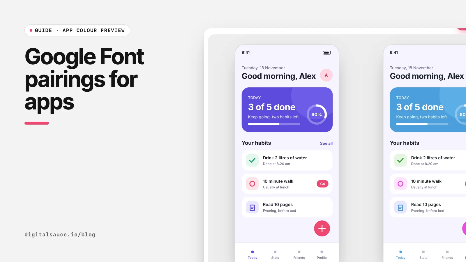
These are the 13 pairings built into our free app colour preview, so you can see each one on your own screen in a click. All are on Google Fonts, free to use under open licences (check each font's licence page for details).
The pairings
| Headings | Body | Feel and best use |
|---|---|---|
| Inter | Inter | Neutral and very readable; a safe default for productivity and SaaS apps |
| Poppins | Inter | Geometric, friendly headings over a calm body; consumer and lifestyle apps |
| Playfair Display | Source Sans 3 | High-contrast serif headings; editorial, fashion and food |
| DM Serif Display | DM Sans | A designed family pairing; elegant but approachable |
| Space Grotesk | Inter | Slightly technical, quirky headings; developer tools and fintech |
| Montserrat | Lato | Bold, wide headings with a warm body; fitness and events |
| Fraunces | Manrope | Soft, characterful serif with a modern sans; wellness and journaling |
| Outfit | Work Sans | Clean geometric headings; marketplaces and startups |
| IBM Plex Serif | IBM Plex Sans | One superfamily, serious and trustworthy; finance, health, enterprise |
| Plus Jakarta Sans | Plus Jakarta Sans | Modern and slightly rounded; a single family that feels current |
| Bricolage Grotesque | Inter | Expressive headings with a dependable body; creative and community apps |
| Lora | Roboto | Literary serif headings over a familiar Android-style body; reading and learning |
| Sora | Nunito | Geometric headings and a rounded body; playful, kids and habit apps |
"Feel" descriptions are our studio's opinion, not a rule. Test with your own content.
Rules that keep pairings working in apps
- Contrast in style, harmony in proportion. Pair a serif with a sans, or a geometric with a humanist, but keep similar x-heights so they sit well together.
- Body text decides. Most of an app is small text, so choose the body font for readability first and the heading font second.
- Two families at most. More slows loading and looks messy. One family with several weights is often better.
- Respect platform sizes. Apple's Human Interface Guidelines list a default text size of 17 pt and a minimum of 11 pt for iOS and iPadOS (Apple HIG: Typography). Check your body font at those sizes.
- Consider the system font. SF Pro on iOS and Roboto on Android load instantly and feel native. A custom font should earn its place.
How to test a pairing on your app
- Export a screen from Figma as SVG with Outline text unticked (how to export SVG from Figma).
- Drop it into the app colour preview.
- Pick a pairing from the Fonts menu. Large or bold text is treated as headings and the rest as body; override either with the Headings and Body menus.
- Save each pairing you like as a variation and compare them side by side. Combine with colour changes to judge the whole feel; see testing brand colours on an app mockup.
Using Google Fonts in your app
On the web, load only the weights you use, with display=swap, or self-host the files. In native apps, bundle the font files with the app rather than downloading them at runtime, and support Dynamic Type on iOS and scalable text on Android so users' text size settings still work.
App colour previewDrop a Figma SVG of your app screen, swap its colours and fonts, and compare variations side by side. Free, no sign-up, runs in your browser.
Open the tool →FAQ
What is the best Google Font for apps?
There is no single best, but Inter, DM Sans, Plus Jakarta Sans and Roboto are popular because they stay readable at small sizes and come in many weights.
How many fonts should an app use?
One or two families. Many apps use a single family in several weights; a second family for headings adds personality.
Can I use Google Fonts in a commercial app?
Google Fonts are released under open licences that generally allow commercial use, including bundling in apps. Check the licence for each font you use.
What font size should app body text be?
Apple lists 17 pt as the default and 11 pt as the minimum text size for iOS and iPadOS. Test your chosen font at those sizes.
How do I preview fonts on my own app design?
Export your screen from Figma as SVG with Outline text turned off, then use the Fonts menu in the free Digital Sauce app colour preview.
Should I use the system font instead?
It is a strong choice: SF Pro and Roboto feel native and load instantly. Use a custom font when your brand needs a distinct voice.
Read next
- How to export SVG from FigmaExport settings, Outline text and Copy as SVG
- How to test brand colours on an app mockupSee the colour on the product, not on swatches
- App colour previewDrop a Figma SVG of your app screen, swap its colours and fonts, and compare variations side by side
- All free design toolsConverters, calculators and colour tools
Last updated 16 November 2026. Sources are linked in the text. Spotted something out of date? Email development@digitalsauce.io.