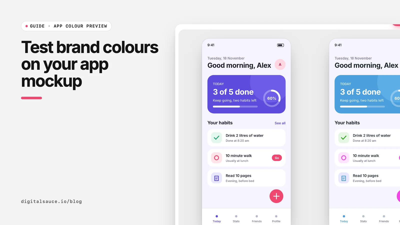
Brand colour decisions often get made from a row of swatches, then look wrong on the first real screen. At Digital Sauce we now test colours on the product itself. Our free app colour preview makes that a five-minute job.
Why swatches are not enough
- Area changes perception. A colour used on a whole header feels stronger than the same colour in a small square.
- Neighbours change colour. The same pink looks different next to grey than next to a warm yellow.
- Roles reveal problems. A colour that is perfect for illustrations may fail as button text contrast.
Step 1: Pick the right screen
Choose a screen that uses colour in many roles: a home or dashboard screen with buttons, cards, icons, a tab bar and some text. Avoid a login screen; it has too little going on to judge a palette.
Step 2: Export it as SVG
In Figma, select the frame, add an SVG export and untick Outline text so you can try fonts too. The full walkthrough is in how to export SVG from Figma. Sketch, Illustrator and Penpot SVGs work too.
Step 3: Recolour with each candidate
Drop the SVG into the app colour preview. It lists every colour, sorted by how much it is used. Then:
- Swap the brand colour. Edit the main accent swatch to your first candidate. Also change its lighter tints so backgrounds stay in the family.
- Or shift the whole palette. The hue presets rotate every saturated colour at once, keeping neutrals as they are, which is a quick way to see "the same app in teal".
- Save the variation and repeat for each candidate.
No candidates yet? Generate some with the colour palette generator, or read how to choose a colour palette.
Step 4: Compare side by side
Saved variations appear next to the original. Look at them together and ask:
- Is the main action still the most obvious thing on the screen?
- Does the colour suit what the product does and who it is for?
- Is it different enough from close competitors?
- Does the text on coloured buttons stay readable? Check the ratio with the hex to RGB converter; WCAG AA asks for 4.5:1 for normal text.
Step 5: Check dark mode and fonts
Tick Dark version to see a rough dark theme, which flips the neutrals while keeping the brand colours. It is not a finished dark mode, but it shows quickly whether a colour glows too much on dark backgrounds. Then try a few font pairings; colour and type work together, and a playful font can make a serious colour feel friendlier. See Google Font pairings for apps.
Step 6: Share the shortlist
Download the best two or three as PNG and put them in front of the team or a few users. Asking "which of these would you trust with your money?" or "which feels most like us?" gets more useful answers than "which colour do you like?".
App colour previewDrop a Figma SVG of your app screen, swap its colours and fonts, and compare variations side by side. Free, no sign-up, runs in your browser.
Open the tool →FAQ
How do I test colours on my app design?
Export a real screen from Figma as SVG, drop it into the app colour preview, change the colours and save each version to compare side by side.
Can I change all the colours of an SVG at once?
Yes. Hue presets and the hue slider rotate every saturated colour in the SVG together, while greys, black and white stay the same.
Which screen should I use to test a brand colour?
A busy one, such as a home or dashboard screen with buttons, cards, icons and text, so the colour appears in many roles.
How can I preview dark mode quickly?
Tick Dark version in the app colour preview. It flips light and dark neutrals to give a rough idea, which you can then refine in Figma.
Do I need the original Figma file?
No, only an SVG export of the screen. The tool reads the colours from the SVG itself.
Read next
- How to export SVG from FigmaExport settings, Outline text and Copy as SVG
- 13 Google Font pairings for appsFree pairings that hold up at small sizes
- How to choose a colour palette for an app or websiteOne brand colour, solid neutrals, real contrast
- App colour previewDrop a Figma SVG of your app screen, swap its colours and fonts, and compare variations side by side
- All free design toolsConverters, calculators and colour tools
Last updated 16 November 2026. Sources are linked in the text. Spotted something out of date? Email development@digitalsauce.io.