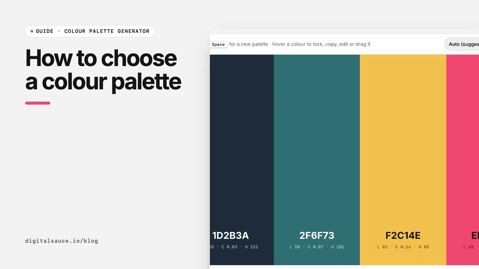
We pick palettes for client apps and websites every month at Digital Sauce. The process below works whether you are a designer or a founder doing it yourself. Use the free colour palette generator to explore options as you go.
Step 1: Decide the roles before the colours
A UI palette is a set of jobs, not a set of pretty colours. Most apps need:
| Role | Used for | Typical choice |
|---|---|---|
| Ink | Body text, icons | A near-black, often tinted towards your brand hue |
| Paper | Backgrounds, cards | A near-white or very light tint |
| Primary | Main buttons, links, key highlights | Your brand colour |
| Secondary | Supporting surfaces, illustrations | A neighbour or complement of the primary |
| Accent | Badges, alerts, the one thing that must pop | A contrasting hue, used sparingly |
Add status colours (success, warning, error) later; they are functional and need their own contrast checks.
Step 2: Start from one brand colour
Pick the colour that says the most about the product: calm blue for a finance app, warm coral for a food app, whatever fits. In the generator, set one swatch to that colour with the pencil, lock it, and press Space. New palettes are built around your locked colour.
Try a few harmony modes. Analogous feels calm, complementary feels energetic, and monochrome gives you a tidy set of shades for neutrals. Our older post on PalettePicker explains the colour wheel schemes in more depth.
Step 3: Use the 60-30-10 rule as a starting point
The 60-30-10 rule is an interior design rule of thumb that translates well to screens: about 60% a dominant colour (usually your background neutral), 30% a secondary colour (surfaces, headers, text), and 10% an accent (buttons and highlights). It is a guide, not a law, but it stops the most common problem we see: a brand colour on everything, so nothing stands out.
Step 4: Check contrast
WCAG 2.2 asks for a contrast ratio of at least 4.5:1 for normal text and 3:1 for large text at level AA (W3C: Contrast (Minimum)). Check every pairing you will actually use: body text on background, button label on primary, link on card.
Many bright brand colours fail with white text. Usually the fix is a darker shade of the same hue for buttons, keeping the bright version for illustrations and large shapes. Our hex to RGB converter shows the contrast ratio against black and white for any colour.
Step 5: Test it on a real screen
Swatches lie. A colour that looks gentle in a 100 px square can be loud across a full screen. Before you commit, drop your app screen into the app colour preview and see the palette on the real layout. We wrote up the process in how to test brand colours on an app mockup.
Step 6: Plan for dark mode
If your app supports dark mode, you need a second set of neutrals, not inverted colours. Dark backgrounds work best as very dark greys rather than pure black, and saturated brand colours often need to be lighter and less saturated to avoid glowing. Check contrast again in both themes.
Common mistakes
- Too many colours. Every extra hue needs a job and contrast checks. Start with five.
- Pure black on pure white. It works, but slightly softened ink and paper are easier on the eyes for long reading.
- Colour as the only signal. Errors should have an icon or text too, not just red, for people with colour vision deficiency.
- Choosing in isolation. Decide with your typography and real content in place.
Colour palette generatorGenerate colour palettes with the space bar, lock the colours you like and export CSS, Tailwind or PNG. Free, no sign-up, runs in your browser.
Open the tool →FAQ
How many colours should be in a brand palette?
Five is a good start: an ink, a paper, a primary, a secondary and an accent. Add status colours for success, warning and error later.
What is the 60-30-10 colour rule?
A rule of thumb: about 60% of the design uses a dominant colour, 30% a secondary colour and 10% an accent. On screens the 60% is usually the background.
What contrast ratio do I need for text?
WCAG 2.2 level AA needs at least 4.5:1 for normal text and 3:1 for large text against its background.
How do I choose colours for an app?
Start from one brand colour that suits the product, generate supporting colours around it, check contrast, and test the palette on a real screen before committing.
Should I use pure black for text?
You can, but a very dark grey tinted towards your brand hue is often more comfortable and feels more designed.
Do I need a separate dark mode palette?
Yes. Dark mode needs its own neutrals and usually lighter, less saturated brand colours, with contrast checked again.
Read next
- The best free colour palette generators in 2026Coolors, Adobe Color, Khroma and more
- How to export a colour palette to CSS, Tailwind and FigmaCSS variables, Tailwind @theme, Figma variables, tokens
- How to test brand colours on an app mockupSee the colour on the product, not on swatches
- Colour palette generatorGenerate colour palettes with the space bar, lock the colours you like and export CSS, Tailwind or PNG
- All free design toolsConverters, calculators and colour tools
Last updated 16 November 2026. Sources are linked in the text. Spotted something out of date? Email development@digitalsauce.io.